
Why flooring, light, stone, and cabinetry should help guide your palette.
Paint is often the first thing people want to choose when updating a room. It’s exciting, it feels approachable, and a fresh color can make a noticeable difference.
But choosing a wall color gets easier when you know what it needs to work with.
The wood beneath your feet, the veining in your countertops, the finish on your cabinets, and the daylight coming through your windows all influence how a color looks once it’s in the room. Taking a closer look at those elements gives you a useful starting point—and can save you from collecting quite so many paint samples.
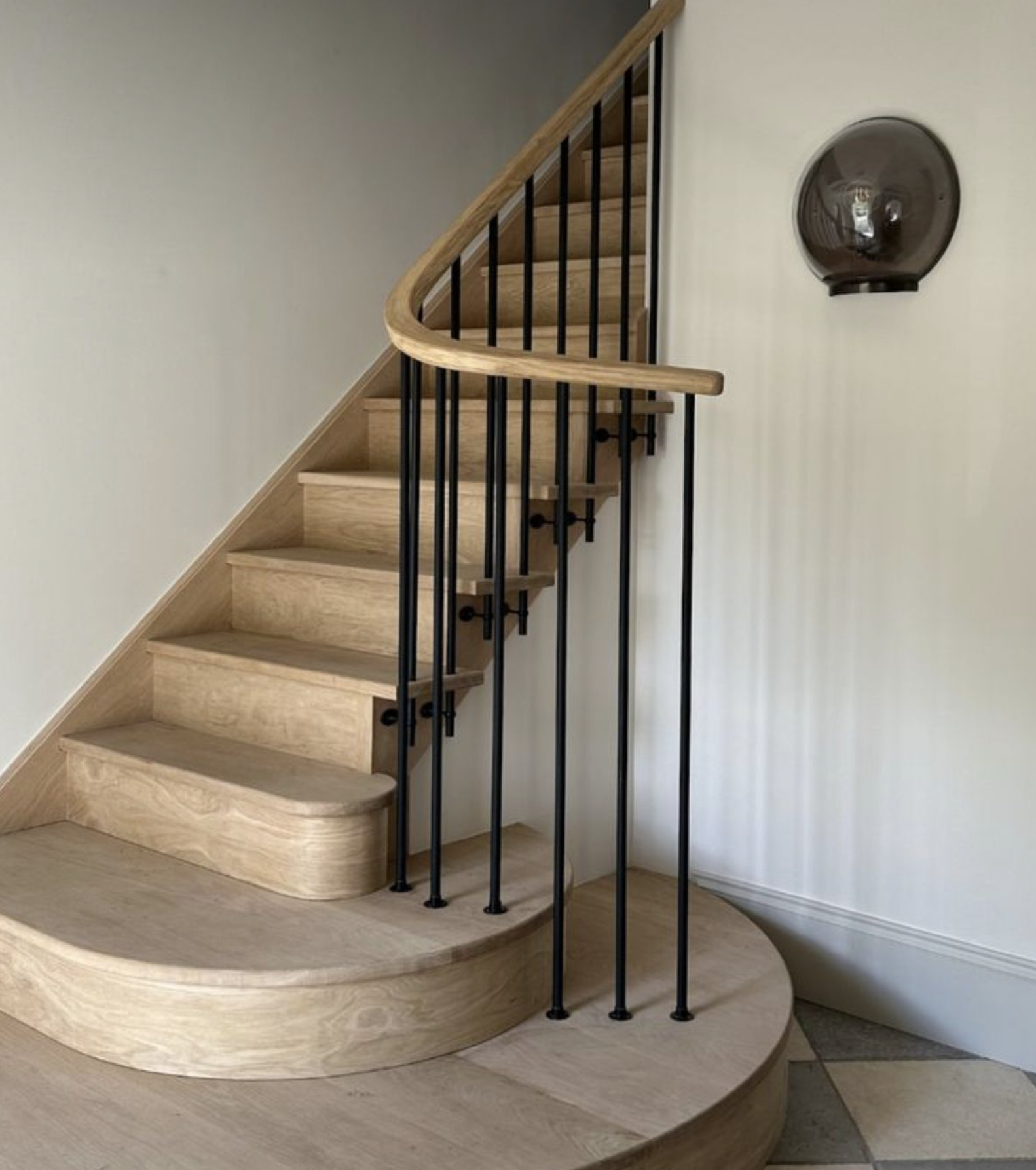
Start with what’s staying
Before opening the paint deck, look at the materials you plan to keep.
Flooring, stone, tile, and cabinetry cover a significant amount of space, so their colors have a strong presence even when they seem neutral. Honey-toned oak brings warmth. A slate floor might introduce blue or green. Cream-colored tile can make a crisp white wall feel surprisingly cool beside it.
Lay out samples of these materials together if you have them. If you’re working with existing finishes, bring paint samples directly to those surfaces. Seeing the relationships up close helps you understand which colors feel comfortable in the room.
For a remodel or new build, we like to establish the main material selections early. There are countless paint colors available, while the right slab of stone or flooring finish may offer a much more specific palette to work from.
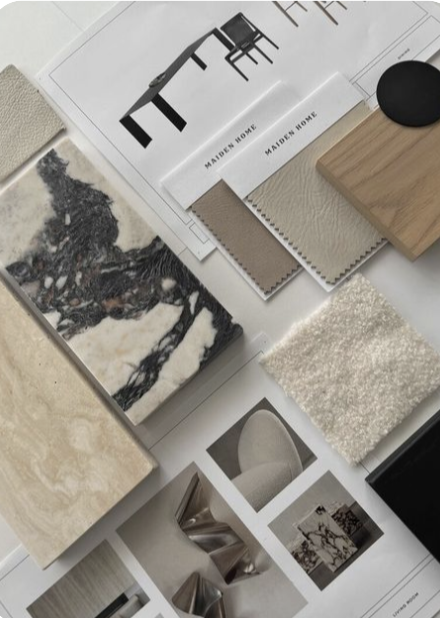
Look a little closer at your neutrals
Beige, gray, white, and brown each contain subtle variations that become more noticeable beside other colors.
A gray countertop might lean violet. An off-white cabinet finish may have a soft yellow cast. Two wood finishes that look similar separately can feel quite different when placed next to each other.
You don’t need to identify every undertone perfectly. Start by noticing whether a sample makes a neighboring material look more yellow, pink, green, or blue than you expected. That reaction can tell you as much as looking at the paint itself.
The goal is a comfortable relationship between the finishes. Warm and cool materials can work beautifully together when the balance feels considered.

Give stone some attention
Stone often contains several colors you can draw from, including quieter shades that are easy to miss at first glance.
A creamy background, a warm gray vein, or a small trace of olive might offer a starting point for walls, cabinetry, or trim. Pulling from one of those less prominent colors can help connect the palette without repeating the most obvious feature of the stone.
Look at the whole slab or a representative section whenever possible. A small sample may leave out the movement and variation that give the material its character.
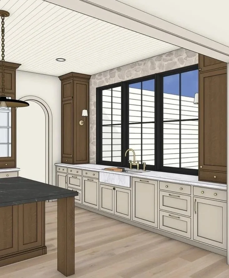
Consider cabinetry and walls together
Cabinetry takes up a lot of visual space, particularly in kitchens, bathrooms, and rooms with built-ins. Its finish deserves a place in the paint conversation from the beginning.
With stained wood, consider both the color and the grain. With painted cabinetry, compare the actual finish to your wall samples. A warm white cabinet beside a cooler white wall can create a stronger contrast than you intended.
Trim matters here, too. View the wall, cabinet, and trim colors together so you can decide how much distinction you want between them. A subtle shift can feel soft and connected, while a deeper contrast can give cabinetry or architectural details more definition.
Let the room’s light weigh in
A color you love in the shop can look different at home. Daylight changes throughout the day, and nearby trees, exterior surfaces, and window treatments can influence the light entering a room.
Your lamps and overhead fixtures matter as well. A paint color that feels balanced in the afternoon may appear warmer under evening lighting.
Try generous samples on more than one wall, or use large movable sample boards. Look at them in the morning, afternoon, and evening, with the lighting you normally use. Keep them near the flooring, cabinetry, and stone so you’re judging the whole combination.
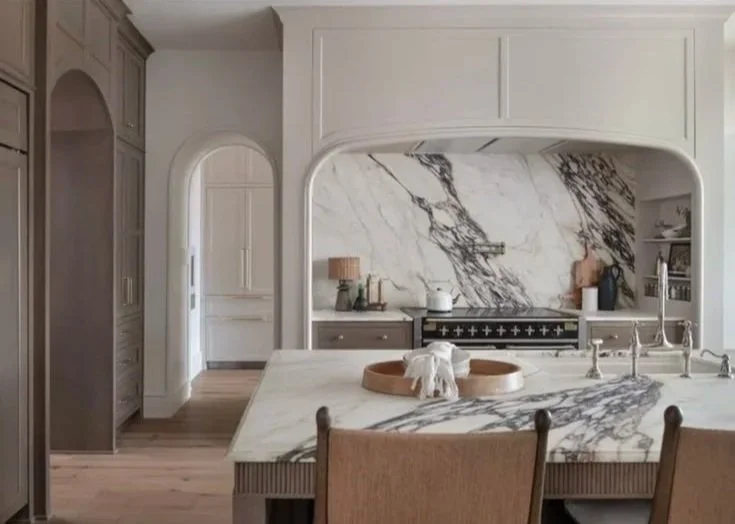
Choose a palette that carries through
Before making the final choice, stand back and look into the adjoining rooms. Notice the finishes and colors visible through doorways and across open spaces.
Rooms can have their own personalities while sharing a few connections. A consistent trim color, related wall tones, or a material repeated in another space can help the home feel cohesive.
At INDIE HOUSE, we consider paint as part of the full material palette. When flooring, stone, cabinetry, and color are selected together, each choice helps the others feel more at home.
Planning a refresh or making selections for a larger project? Connect with our design team to build a palette that works beautifully in your space.
